‘Partners’ diagram: my workings out

Maths teachers are forever drumming it into their pupils that showing their workings out are nearly as important as the answers themselves. Neat rounded totals without the scribbled meanderings and eraser dust shed no light on a pupil’s process and progress.
Because my diagrams are almost always born out of a desire to solve a problem or an attempt to align certain things in my own mind, I’m more than aware that a diagram such as ‘Partners for the content strategist’ is unlikely to sit comfortably with everyone. So, to help you understand why I came to certain conclusions and shed a little light on my process, I thought I’d show you my workings out. Think of this, if you will, as akin to the last ten minutes modern natural world documentaries tend to reserve for a behind-the-scenes look at how a film crew captured a particularly challenging scene; except I was sat in a comfortable chair throughout, rather than going toe-to-toe with one of Mother Nature’s finest.
The problem
I wanted to find a way of mapping the tasks/deliverables associated with a mid-to-large organisation’s typical (as typical as any can be) content lifecycle with the practitioners who may be directly involved in their conception and completion. Faced with the problem of how to visualise this I did what any content strategist worth their salt would do and retreated to a place of immediately safety and familiarity: the spreadsheet.
The spreadsheet
Though I feared ending up with something resembling a bird’s nest I decided to begin by linking each content project task/deliverable with one or more practitioners who may benefit from the presence of a content strategist to consult or partner with – no matter how tenuous that link may be. I then repeated the same exercise again, only this time concentrating on essential links between the tasks/deliverables and each practitioner. Each essential link was highlighted by a darker cell colour and denoted with a ‘1’ to keep an automatic running total. Have a look at the spreadsheet for yourself.
After an inordinate amount of time consulting various books and recalling past experiences the table was complete. It was only now I realised I still had to find a way to visualise it. Step forward that six-sided king of regular polygonal tiling: the hexagon.
The prototype
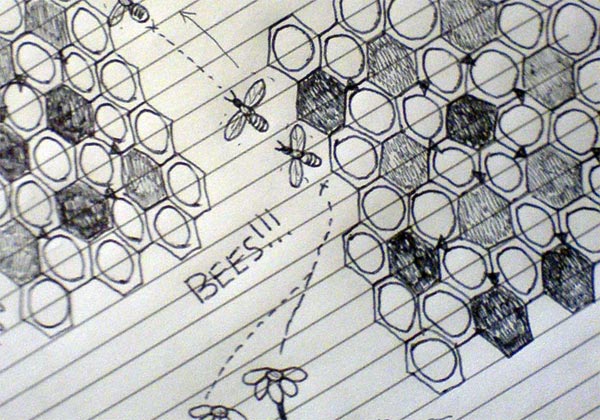
Honey bees and content strategists? In truth I’ve yet to make that connection stick myself, but don’t forget I managed to wrap a game of snakes and ladders (did anyone actually play it?) around the trials and tribulations of an in-house content strategy advocate. I have, so they say, ‘form’ in this respect.

Though these rather crude scribbles of honey bees and honeycombs did not provide me with the theme I was looking for they did, at least, inadvertently guide me towards the hexagon – a shape I’d used to decent effect before.
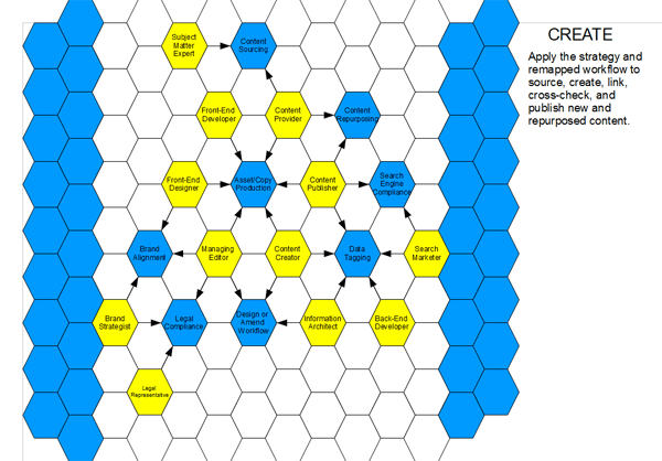
It was now time to make the switch from paper to the screen. At this early stage I opted for OpenOffice.org’s Draw, due in no small part to its ability to successful manage the incessant fiddling that would come to characterise the piecing together of this diagram. Using Draw would also prevent me from getting too precious over how it looked – though, as you can see, I couldn’t help taking full advantage of this afforded opportunity to pay homage to a certain hexagonal-based television game show.

The use of tiled hexagons turned out to be something of a troublesome blessing. Having only six edges meant that any single task/deliverable or practitioner had a fixed limit as to how much weight in links they could carry. On one hand this was advantageous because the last thing I wanted was more arrows flying around than in the opening sequence from ‘Gladiator’ but, at the same time, I was acutely aware I could be doing a particular discipline an injustice by not considering their involvement to be important enough to mention. Thankfully, following extended bouts of head-scratching and blank gazes into the middle distance, I had a prototype ready for beautifying.
The snazzy Photoshop bit
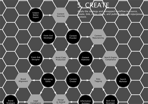
Working initially in greyscale enabled me to find a suitable contrast balance between the tasks/deliverables and the practitioners before the fiddly aspect of colour was applied, but there remained a niggling problem differentiating between the two groups of hexagons. In a bid to counter this I considered offering an obvious size difference between the two but as this would adversely affect the tiling it was quickly ruled out. I also briefly entertained ideas of changing the font (Lucida Sans Unicode) to one which allowed for a heavier weight option and using upper-case lettering. After consideration I decided to keep the size and the font, plumping instead for changing the shape of the practitioner’s hexagon to that of a circle.

With the colours for each project stage already predetermined back when I compiled the spreadsheet all I had to do now was find legible variants for each. Though as a colour-blind individual I can’t say I’m overly fond of mixing certain shades of blues and purples, greens and yellows, and reds and greens. Thankfully the colour wheel and my only brother with no colour vision deficiencies to speak of (and a man who knows his colour theory) rode to my rescue.
The final diagram
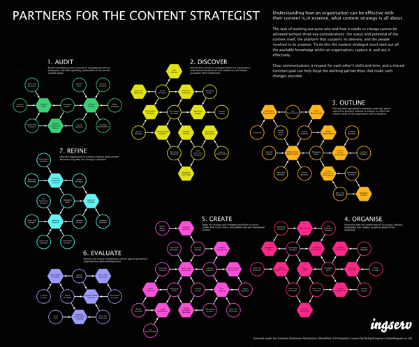
And that was that. Save for a bit of indulgent nudging, preening, and slicing the diagram was complete. Maybe some day I’ll do one of these in the style of an open project and get the wider community involved in its conception. I mean, there’s nothing quite like trying to reach large-scale consensus, right? On second thought, I think I could quite easily talk myself out of that one …
![]() Partners for the content strategist (827 KB)
Partners for the content strategist (827 KB)
Note: This diagram is licenced under the Creative Commons Attribution-ShareAlike 3.0 Unported Licence. By all means bend, shape, and prod it.

Pingback: Help shape my next diagram | Richard Ingram | Shut the door on your way out, Cicero…