Writing web content with dyslexia in mind
Dyslexia is a learning disability that affects an individual’s visual comprehension of written language. While its severity and effects vary from person to person, what can learning more about how some people with dyslexia see the written word help us when creating web content?
Dyslexia Australia’s website has a particularly fascinating page which attempts to describe and demonstrate the visual stresses that occur when some people with dyslexia read. I’m going to try to faithfully re-create some of their observations here.
Attaching mental pictures to words
Some people with dyslexia comprehend certain words by attaching a mental picture to them. Take this short extract is from Oscar Wilde‘s ‘The Importance of Being Earnest‘.
Garden at the Manor House. A flight of grey stone steps leads up to the house. The garden, an old-fashioned one, full of roses. Time of year, July. Basket chairs, and a table covered with books, are set under a large yew-tree.
Now try reading the same extract but only reading the words that emphasised in bold type.
Garden at the Manor House. A flight of grey stone steps leads up to the house. The garden, an old-fashioned one, full of roses. Time of year, July. Basket chairs, and a table covered with books, are set under a large yew-tree.
Sadly not all sentences conjure up as many mental images as my example, but I guess that attaching such images must act as clues as to the subject and direction of a sentence.
Rivers of words
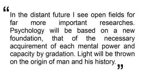
Dyslexia Australia also describe the ‘rivers of words’ that some people with dyslexia see when reading. This next extract is from Charles Darwin‘s ‘On the Origin of Species‘ (Figure 1).

Figure 1 - An extract from Charles Darwin's 'On the Origin of Species'
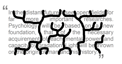
Figure 2 shows the same extract, but now all of the words are faded into the background and heavy lines have been woven between the words. I’ve used justified text here, with its variable spacing between individual words, to accentuate the point.

Figure 2 - The same extract, but this time with 'rivers of words'
Not so easy to read now is it? This inability to scan freely means you almost have to break it down to a single word at a time. Some people with dyslexia experience these visual distortions when reading, so rather than being drawn to the words on a page they are instead drawn to the spaces between them.
Reading on the web
So how can we help people with dyslexia read more effectively on the web? Some benefit greatly from the synthesised voice output from a screen reader, which helps them scan and track the text on a web page, as well as breaking down pronunciations.
In fact, pronunciations are the real issue here. I was surprised to learn that the main cause or factor in most cases of dyslexia is not to do with vision but phonology – or rather how the person converts what they see into the sound units that make up a single word.[1]
Some may prefer to use a web browser plug-in which allows them to remove a website’s default stylesheet or override it with a customised version of their own. We’ve all come up against web sites that have an distinctly unhealthy penchant for long line lengths, tiny font sizes and harsh back/foreground combinations.
I often find myself turning to the readability bookmarklet from arc90. It really helps make even the most poorly presented written content more inviting – especially with a pair of tired eyes at the end of a long day.
Some people with dyslexia prefer not to use a screen reader, personal stylesheets or any kind of assistive technology while browsing the web. So how can we help them? I believe you can’t go too far wrong using:[2]
- Short, sharp sentences – favouring shorter words wherever possible
- Clear Headings
- Bulleted lists – helping to summarise points or entire articles, often at the start to explain what you’re about to read and learn
- Healthy line height and letter spacing – preventing eyes wandering to the next or previous lines
- Static imagery – acting as visual memory aids and helping to enhance contextual understanding
Hang on, isn’t that how we all like to read on the web?
Pingback: Tweets that mention Writing web content with dyslexia in mind | Shut the door on your way out Cicero… -- Topsy.com
Pingback: uberVU - social comments
Well said! This post provides an in-depth look at how dyslexia can affect people’s ability to read. Thank you for sharing, your advice is sound and thoughtful.
Thank you for spreading understanding of dyslexia.
You have done a great job “re-creating”.
Not many dyslexics experience these distortion however, for those that do, it is very stressful.
For more information on visual distortions experienced by some dyslexics, please visit my other website http://www.dyslexiasupport.com.au
It is important to understand that dyslexics are visual thinkers therefore the language used must be easily convertered into pictures. For example: “sit on the chair” is easier picured than “do not sit on the chair”.
Thanks again.
Amazing! Never thought about dyslexia when working on our website redesign, for which we comply with AA standard accessibility rules. Thanks for such a clear approach. And thanks to Brenda also for providing useful link.
Making websites accessible to dyslexic users we’ll be making them more accessible also to elderly users or people with cognitive disabilities as well.
Conxa
@innova2
Brenda – thanks for the link. The flash animation on the front page alone makes for interesting viewing.
Conxa – exactly, I believe that by making small, but significant changes to the way web copy is rendered helps everyone to feel more comfortable while reading.
Pingback: Twitted by dianarailton